Separator
Visually divide content sections
Usage
import { Separator } from '@heroui/react';Examples
Variants
With Surface
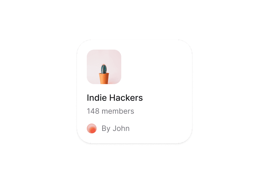
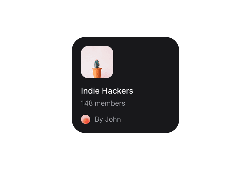
The Separator component adapts to different surface backgrounds for better visibility.
Vertical
With Content
Decorative
Use isDecorative when the divider is purely visual, such as between listbox sections. It renders an aria-hidden div by default with presentational semantics, while preserving its visual styles. Custom render functions receive the decorative props and ref.
<Separator isDecorative />Render Function
Customization
Tailwind CSS
Global CSS
To customize the Separator component classes, you can use the @layer components directive.
Learn more.
@layer components {
  .separator {
    @apply bg-accent h-[2px];
  }

  .separator--vertical {
    @apply bg-accent w-[2px];
  }
}
Styling Reference
HeroUI follows the BEM methodology to ensure component variants and states are reusable and easy to customize.
CSS Classes
The Separator component uses these CSS classes (View source styles):
Base & Orientation Classes
.separator- Base separator styles with default horizontal orientation.separator--horizontal- Horizontal orientation (full width, 1px height).separator--vertical- Vertical orientation (full height, 1px width)
Variant Classes
.separator--default- Default variant with standard contrast.separator--secondary- Secondary variant with medium contrast.separator--tertiary- Tertiary variant with subtle contrast
API Reference
Separator
| Prop | Type | Default | Description |
|---|---|---|---|
isDecorative | boolean | false | Hides a purely visual divider from assistive technology and removes separator semantics |
orientation | 'horizontal' | 'vertical' | 'horizontal' | The orientation of the separator |
variant | 'default' | 'secondary' | 'tertiary' | 'default' | The visual variant of the separator |
className | string | - | Additional CSS classes |
render | DOMRenderFunction<keyof React.JSX.IntrinsicElements, undefined> | - | Overrides the default DOM element with a custom render function. |